The Analysis Panel
Once you have identified your region of interest, the analysis pane will automatically pop-up in the top-right corner of your screen with three tabs visible, described below.
Vegetation Cover plots
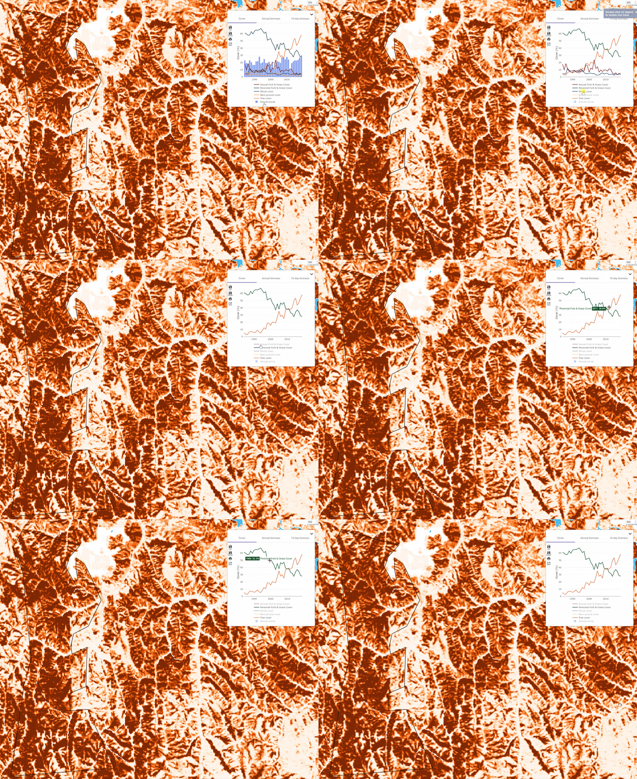
Once the Analysis Panel initiates, by default the Vegetation Cover plot will display in it. You will see that the plot displays each of the plant functional types (PFTs) as well as annual precipitation — each of these values is an average over all of the pixels in your region of interest.
The graph itself is highly interactive and allows you to customize it in a variety of ways. When you scroll over the plot, pop-up text displays values for the datapoint closest to your cursor. You can also control which PFTs appear on the plot by single- (turn off) or double-clicking (making that PFT the only one that displays) the labels in the legend.
Loess Canyons example
See below, as we revisit our example from the Loess Canyons, Nebraska and produce a plot displaying only tree cover and perennial forb and grass cover. Reducing data in the plots can help us to focus on the trends that are most important in our region of interest. In this case, we can see that as tree cover increases, perennial forb and grass cover decreases.

Annual Production plots
In general, the plots of annual production are almost identical to those of vegetation cover, with the same interactive features.
Hot Pot Fire example
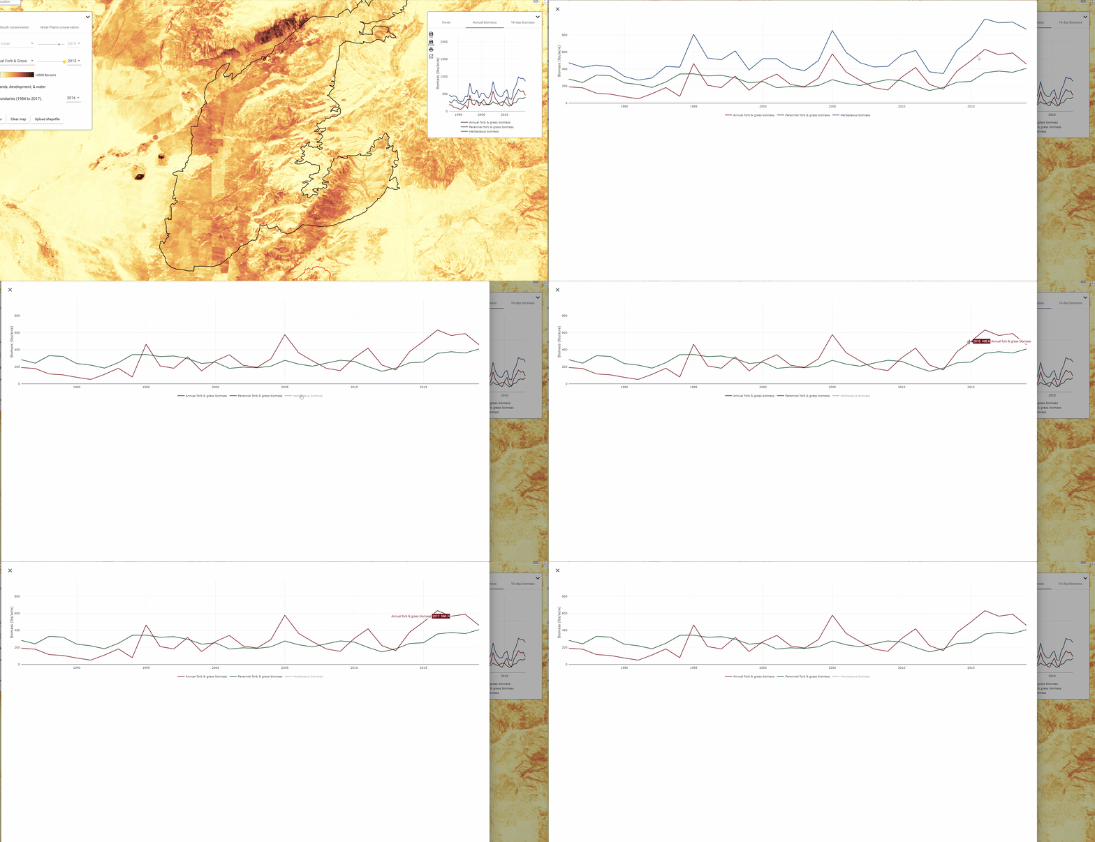
As an example, we will revisit our example from the Hot Pot fire of 2015 to look at the annual production plots in some more detail. One thing that you may notice in working with the annual production plots, especially in rangelands with relatively low production like the Great Basin, is that the axes in the main plots don't scale, making the data appear scrunched together. In the animation below for the Hot Pot fire, I expand the plot to the full window which then rescales the axis to make it easier to see annual variation. I also turned off herbaceous production in the plot to focus on the relationship between annual herbaceous and perennial herbaceous production — notice that annual herbaceous production has increased relative to historic levels since the fire in 2015.

16-day production plots
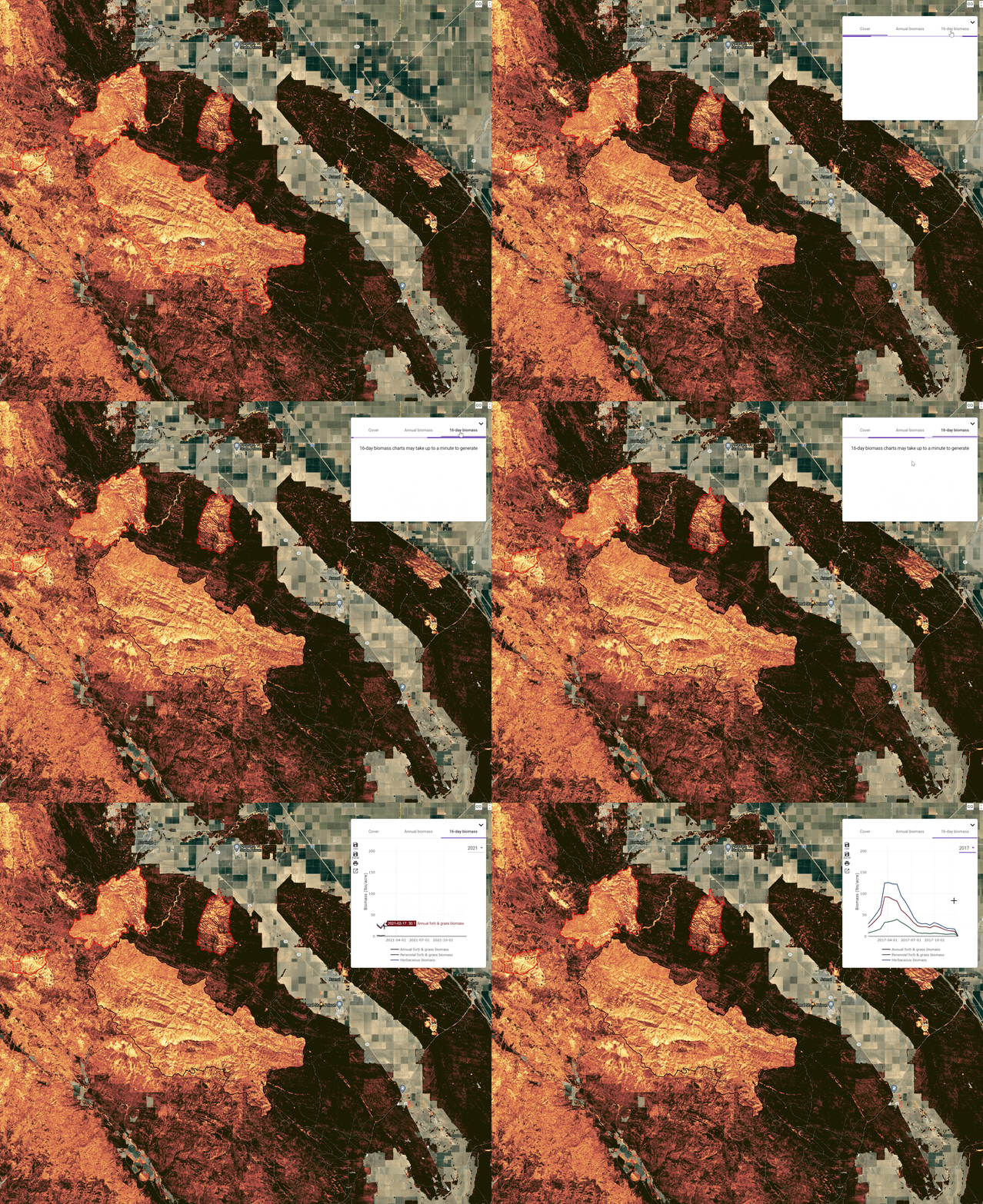
One of the most groundbreaking aspects of the Herbaceous Production dataset available in RAP is the near-real-time estimates of herbaceous production. These observations, produced every 16-days, enable the user to track production continuously over the 35-year+ archive of RAP data.
As of the writing of this tutorial, it is February and herbaceous production hasn't begun in much of the western US — but, it has in parts of California. The Garza Burned nearly 50,000 acres southwest of Fresno, California in 2017. Observations of 16-day production have already become available for February 2021, with the most recent observation just 4 days ago. In these plots, we can see how this year's production is shaping up against previous years using the year drop-down menu.

Additional options
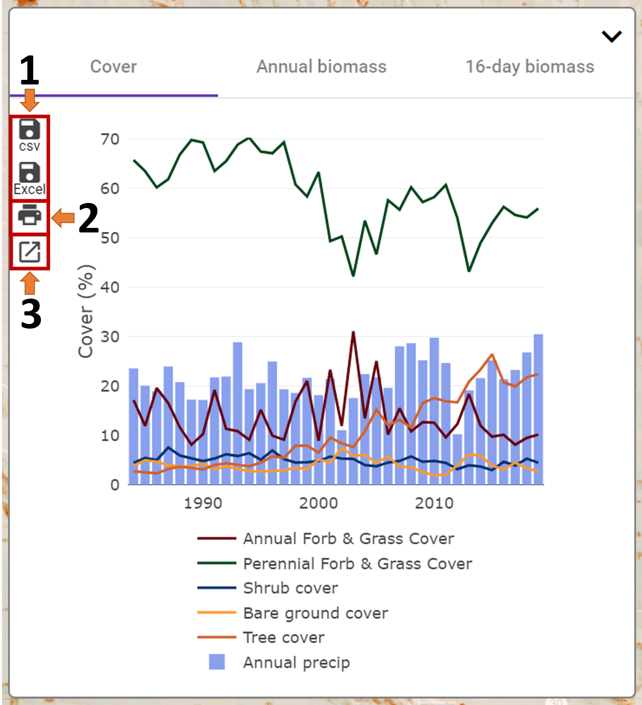
Within each tab of the Analysis Panel there are three additional features that are useful to highlight, depicted in the image below
- You have the ability to export a comma-separated value table (CSV) or an Excel spreadsheet with the data displayed in the plots. Exporting data is useful if you'd like to explore different ways of plotting the RAP data or if you are working with data from multiple locations. In the future, we will have tutorials that will describe ways to plot RAP exports using software like Excel.
- The print button allows you to print your plot to an image file.
- The enlarge button opens up your plot into a full window view, allowing you to see the trends in greater detail.

