Visualize RAP data in Excel
RAP data can be downloaded for your region of interest as either a comma-separated value table (CSV) or as an Excel workbook (.xls) from the Analysis Panel. Regardless of how you download the data, you will interact with it in the same way in Excel.
Note:
For a demonstration of how to download data, visit our article on the Analysis Panel.
Once you have downloaded your data, you can visualize it in Excel in almost an endless variety of different ways. Rather than going one-by-one through each of the types of plots, here we present some general steps and tips for exploring your data in Excel. After all, you are the expert on the important vegetation trends in your region.
Plotting data:
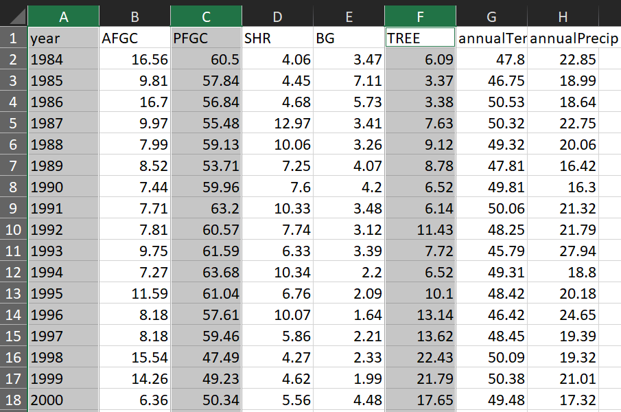
First, highlight the columns of data that you are interested in. In this example, I was using the Vegetation Cover data for a region that has experienced conifer expansion, so I highlighted the 'year', 'PFGC', and 'TREE' columns. Holding down the ctrl or cmd key to select multiple columns.
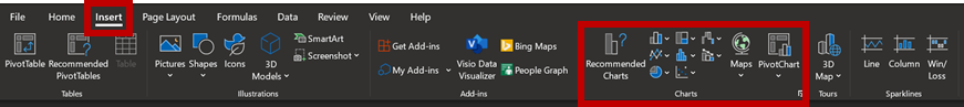
Then, you can explore the different types of charts available by first clicking the 'Insert' tab and then using the 'Charts' panel.
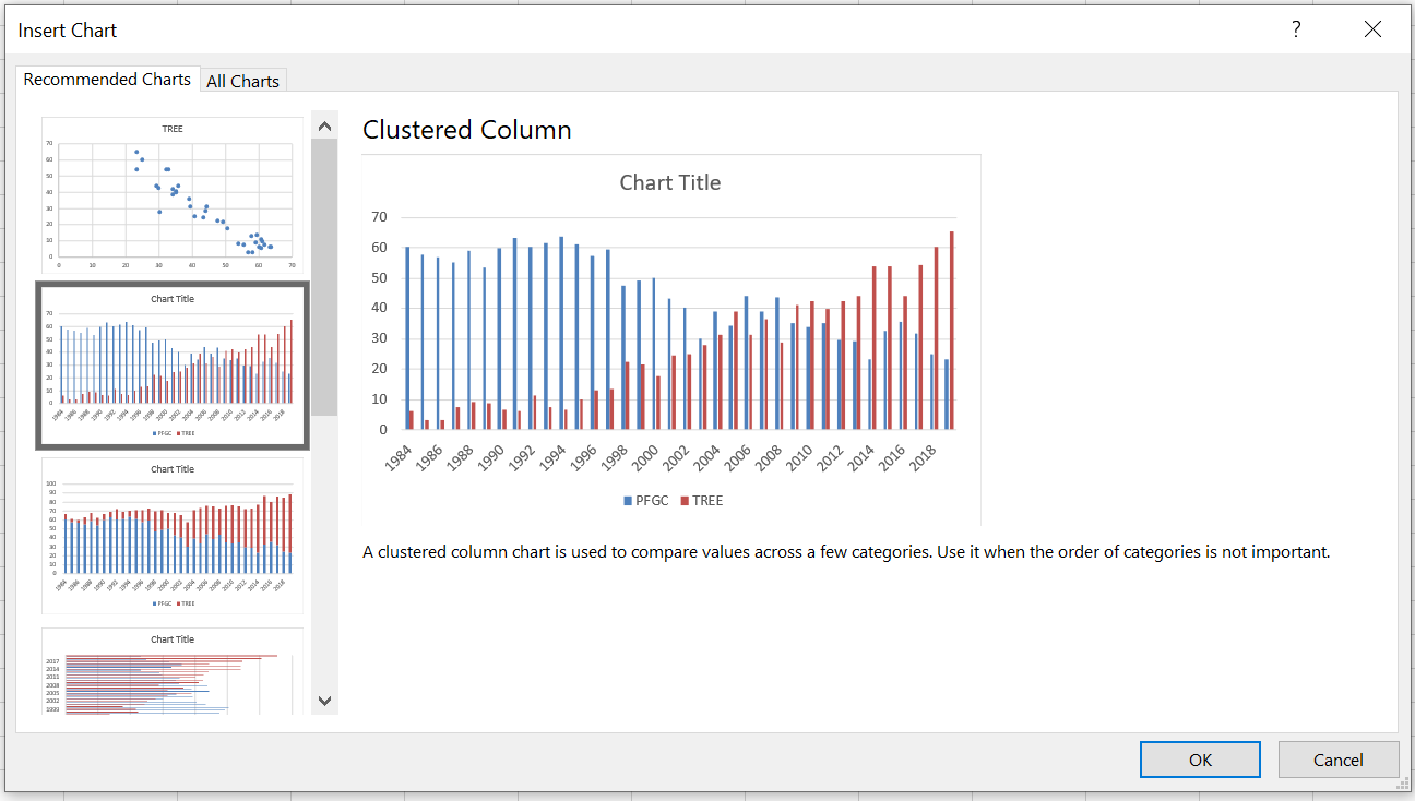
Clicking 'Recommended Charts" will display options that Excel predicts will be useful or interesting for your type of data. In many cases, Excel is able to recognize that we are using time-series data and selects appropriate plots for showing change through time.
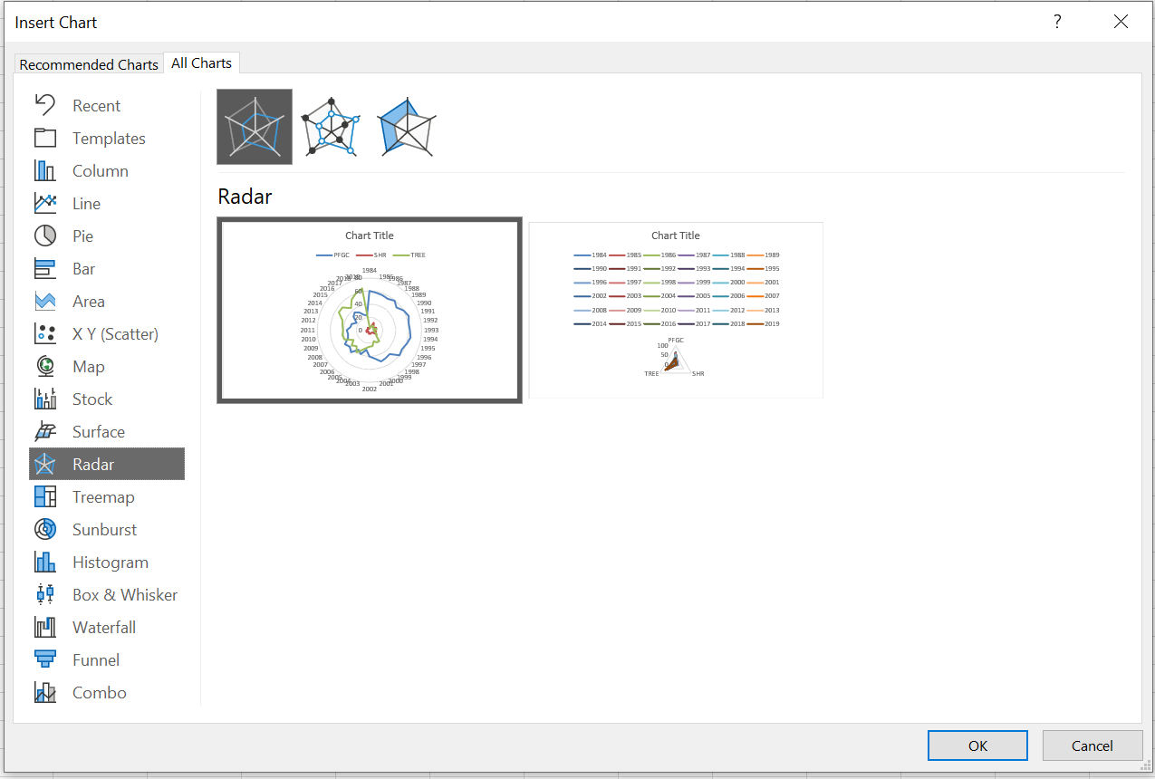
Or, if you're not finding what you're looking for you can use the "All Charts" tab of the window displayed above to find something more interesting.
Happy plotting!